
UX/UI Improvements
Role: UX/UI Designer
Impact: Improved and provided better clarity and user experiences throughout the website at the journey, page, and component levels. Featured in this case study are redesigns for the signup app, navigation, and pricing comparison chart.
OVERVIEW // SIGNUP APP
Project Goals
Reduce both friction and overwhelm of the current signup app design
Introduce add-on options for users
Update the design to better suit the rebrand and new design system
Increase conversion rates at this stage of the user journey
Challenges
Backend restrictions forced us to rethink our strategy
The signup app saw the highest number of user drop off compared to any other point in the signup flow. The hypothesis was that requiring a credit card at checkout, even when just wanting to sign up for a free trial, was the primary cause of the high drop off rate. Due to backend restrictions, we could not action on running experiments where we wanted to remove the credit card capture altogether.
If the credit card capture could not be removed, the question became: What else can we do to reduce friction in this flow?
EXECUTION // SIGNUP APP
Assessment of Current State
Cluttered multi-step UI as friction points
Add-on UI is out of place and disconnected from the flow of content
UI is outdated and overwhelming
Redesign Proposal - High Fidelity Wireframes
Reduce multi-page layout to a single page with collapsible elements to allow a user to navigate complex information more efficiently
Switch to a cart-style layout to make the billing summary clearly visible and intuitive to a user
Showcase plan details upfront alongside add-ons to reinforce package value and allow users to be able to edit their plan
KEY TAKEAWAYS // SIGNUP APP
Internal User Feedback
This project went through a round of internal usability testing which came back with positive feedback from different departments stating that the UI was easy to navigate and that by the time they reached the billing information section, they had felt like they had a clear grasp of what they were signing up for and subsequent value markers.
Lessons Learned
Being able to clearly show and define value add to a user helps to build the confidence they need to proceed in their journey. With the credit card capture still being a necessary form of friction, it was integral to make sure that plan and billing details were well defined and easy to digest.
OVERVIEW // PRICING COMPARISON CHART
Project Goals
To reduce overwhelm and cognitive overload in the Pricing Comparison Chart
To improve scannability of comparison items
To provide a cleaner and smoother experience for a user to find the information most relevant to them faster
To be able to include the chart for mobile users
Challenges
The need to represent a new chart condition
The pricing packages offered by Hootsuite were undergoing a change and required a new legend item to represent when a feature would be included in a plan that had multiple users
Mobile-friendly considerations
The chart showcases an overwhelming amount of information upfront to a user that they need to scroll through
EXECUTION // PRICING COMPARISON CHART
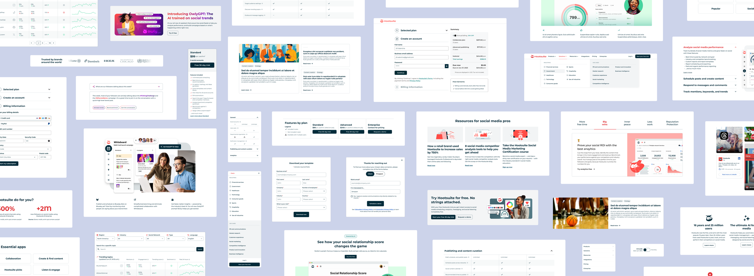
Assessment of Current State
The current design of the comparison chart showcases the enormous breadth of the Hootsuite product offering, however, it is also displaying an overwhelming amount of information in a format that doesn’t allow a user to easily find what may be most relevant to them. Use of the accordion function for each specific feature also creates unnecessary micro movements within the chart UI.
Redesign Proposal - High Fidelity Wireframe // Sticky Comparison Header
Before diving right into the heart of the chart redesign, I executed a new approach to the sticky comparison header. The header of the Pricing Comparison Chart serves multiple functions:
Being persistent throughout the chart for users to clearly be able to compare what is available across all of the plans
Including CTAs to reduce friction for a user to convert if they are ready to make a decision mid-chart
Having a persistent legend, especially with a newly introduced icon, maintains visible accessibility and allows users to make visual connections faster
I introduced a new icon that represents when a feature is available for a plan, but only when the plan includes multiple users. In order to make it clearer for a user to compare between plans, I also adjust the hierarchy of information so that the plan names had more emphasis than pricing. By this point in the user journey, if a user is exploring feature comparisons, price is likely a secondary consideration as the user is looking to justify their purchase decision.
Redesign Proposal - High Fidelity Wireframes // Default View & Expanded Example
Overall changes:
Grouped sections into an accordion component to make it easier for a user to find feature blocks that would be the most relevant to them
Introduced alternating table background colours by row to improve scannability of features between plans
Replaced description accordions with tooltips for quicker access to context and to remove the need for the UI to jump every time a feature is expanded
Replaced the (X) icon with a lighter (–) icon
Internal user feedback showed that the dashes were easier to process, making it easier to scan through items in the chart
For the default view, the General section is already expanded to provide immediate context that each section is interactive
Grouping sections into the accordion component provided an opportunity for me to redesign the chart UI in a way that helped reduce cognitive overload. Whilst sections could still hold a lengthy amount of information, subtle UI changes such as adjusting icons and introducing row colours ultimately improves a user’s ability to scan through the chart and access a specific feature set faster.
Redesign Proposal - High Fidelity Wireframes // Mobile
Because of the desire to have the comparison chart available to mobile users, this heavily influenced the decision to use the accordion component for use across both mobile and desktop. With the amount of information in the chart already being overwhelming on desktop, it was an additional challenge to find a solution for the mobile experience.
Overall, I wanted the functionality to be similar, with a sticky header that allowed for quick and easy comparison, and collapsible sections that made finding relevant features quick and frictionless.
Similarly, I wanted to adopt this collapsible feature for the plan cards as well to keep things succinct within a screen view.
KEY TAKEAWAYS // PRICING COMPARISON CHART
Experiment Results
Whilst the accordion design adds extra clicks in the process, it reduces friction in reducing the amount of time it takes for a user to find what they are looking for. Through an A/B test between the current design (the control) and the proposed new design (the variant), early results showed an increase in conversion by a rate of 1.3% with the variant. Clearer distinctions in hierarchy and how information is presented to a user heavily impacts end user behaviour.
This redesign is currently in the development queue for prod.